
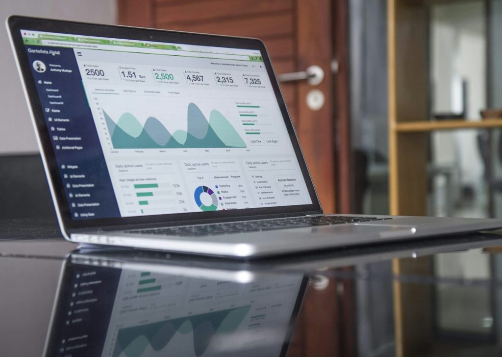
Many businesses spend time connecting data, designing charts, and sending automated reports, yet their Monday operating meeting still begins with the familiar question: “What is actually happening?” The problem is often not a lack of numbers. The dashboard has shown people too many measures without giving them a path from signal to decision. It becomes an attractive wall of information: everyone can see it, but few know what to do differently.
A valuable dashboard does not need to answer every question. It should help the accountable person spot a meaningful change, ask the right next question, and select an action that can be checked. That requires starting with the unit’s decision rhythm, rather than with the list of available data. If no decision would change when a chart changes colour, that chart does not yet need a place on the first screen.
Start with the meeting and the decision, not the metric
Look at a typical operating meeting. A manager may need to decide which customers to prioritise, where to adjust capacity, whether to intervene in a process, or whether to wait for more evidence. Each decision needs a small number of guiding signals. To decide whether to add shifts to a delivery team, for example, a business needs order volume by area, actual backlog, committed capacity, and the service level being affected. One total-revenue number can help with the broad picture, but it cannot answer that decision.
Writing one decision sentence before selecting a metric creates needed discipline: “If indicator X exceeds threshold Y for Z days, who will consider which action?” This separates a metric that is merely observed from a metric that is managed. It also forces the team to state the limits of the data. A conversion decline may come from lead quality, a checkout fault, a pricing-policy change, or simply a period too short to read. A good dashboard does not pretend to know the cause; it tells the viewer where to investigate.
| Component type | Question it must answer | Appropriate example |
|---|---|---|
| Outcome indicator | What has happened? | On-time delivery rate this week. |
| Leading indicator | What may change the outcome? | Unassigned orders by area. |
| Action threshold | When must it be revisited? | Backlog exceeds one shift’s handling capacity for two days. |
| Investigation path | Where should detail be checked? | Orders, shifts, and delay reasons by area. |
Do not show an outcome metric on its own
An outcome metric says where the business is, but rarely where to repair. A declining repeat-customer rate, for example, signals a concern. To act, a manager needs to see where customers leave, which customer groups are affected, request-handling time, error rates, or a change in service policy. Not every number needs to sit on one screen, but the dashboard should create a short path from a broad signal to data sufficient to test a hypothesis.
This also means a dashboard should not become a place to judge people with a red or green colour. When people know a metric is used mainly to assign blame, they have an incentive to protect the number rather than surface an early signal. A better practice separates operating monitoring, learning from anomalies, and performance evaluation. An exception reported early can help a team act before it becomes a poor month-end metric.
Example: a dashboard for a B2B sales team
A company tracks only total opportunity value and signed revenue. At the end of the quarter, the team is often surprised when revenue falls short even though the “pipeline is large.” After redesign, it keeps both outcome metrics and adds the share of opportunities with a clear next step, days without contact, the share with a verified decision-maker, and loss reasons by segment. Every Monday, the team lead does not demand an explanation for every chart. They review only high-value opportunities with no next step for ten days, then decide whether to support the account, change the message, or stop investing. The dashboard becomes an operating tool rather than an end-of-period presentation.
Design for the person who must act, not only the person who watches
The first dashboard user should be asked three questions: when do they open it, what can they change, and what detail do they need before they call the team? The answers determine the appropriate aggregation, filters, and alerts. An executive may need a weekly trend; a shift supervisor may need a list of work requiring attention today. Forcing one screen to serve both usually makes it too general for operators and too detailed for senior decision-makers.
Alerts also need restraint. If the system flags every small movement, people will mute notifications or gradually ignore warning colours. Set an alert only when an action has been agreed in advance: check the data, contact a customer, reallocate resources, or open a review. For measures that naturally vary day to day, prefer a trend and a meaningful time window to reacting to every data point.
Treat the dashboard as a hypothesis to be tested
After several weeks, the team should ask: which measures actually led to a better decision; where do users still have to download a spreadsheet or ask manually; which alerts are ignored; and which data are easy to misunderstand? These questions allow the team to remove charts that do not create value and clarify definitions that differ across functions. A dashboard is not a product completed on handover day. It is part of the operating process and should change when decisions, data, and ways of working change.
The simplest test is to look at Monday morning. After viewing the dashboard, does an accountable person know which conversation needs to happen, which hypothesis needs checking, and which decision needs to be made that week? If so, the data are helping work move. If not, reduce the metrics and return to the real decisions the organisation must make.