
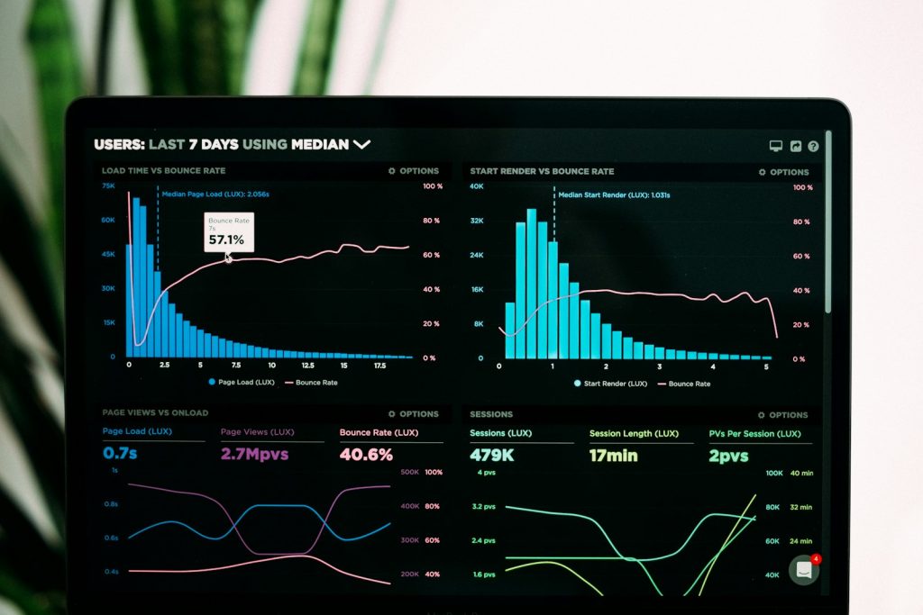
A visually appealing dashboard can make an organization feel data-driven. But if viewers do not know what they should decide after seeing it, the dashboard is only an expensive reporting screen. Its value does not come from the number of charts. It comes from helping managers identify a change, understand what needs to be checked and act at the right time.
Many teams begin a dashboard by asking, “What data do we have?” That starting point often produces a screen filled with every available metric: revenue, orders, traffic, costs, inventory, productivity and response rates. Viewers may see many numbers without knowing which ones matter to the current objective, which signal requires intervention or who should be accountable. A better design starts in the opposite direction: what must a manager decide, how often, with what evidence, and what action will that decision change?
Start with the decision question
A weekly sales dashboard should not only answer how much revenue has been achieved. It should support more precise questions: which area, customer group or channel is behind; whether the cause is customer traffic, conversion or basket value; and which team needs support next week. Each question needs a small set of connected indicators. When a dashboard is not tied to a specific decision, users commonly look at it for information and then return to intuition or separate spreadsheets for the real discussion.
A practical method is to list the recurring decisions in a management cycle. For a sales director, these may include allocating targets, prioritizing customers, adjusting sales activity and removing bottlenecks. For an operations leader, they may include balancing capacity, resolving delayed orders, controlling errors and revising work schedules. Only then should the team identify the data that is genuinely useful for each decision. This also removes metrics that are interesting but do not lead to action.
Applied example
A retail chain sees that revenue at one store has fallen 12% year on year. If the dashboard shows revenue alone, the manager knows only that there is a problem. When it places revenue beside footfall, conversion, basket value and stockout rate, the team can distinguish four different responses. Lower footfall suggests reviewing location, communication or weather; lower conversion requires checking the in-store experience; lower basket value points to assortment and cross-selling; a higher stockout rate calls for supply-chain action. The same outcome metric can therefore lead to very different decisions.
Use leading indicators, not only outcome indicators
Revenue, profit, customer retention and satisfaction are outcome indicators. They matter, but they often appear after a problem has already occurred. A management dashboard also needs leading indicators: signals that allow the organization to intervene earlier. Before retail revenue falls, for example, the company may see declining availability of core products, longer customer-response times or a lower repeat-customer rate. Before service quality declines, it may see more cases that require rework or waiting time that exceeds the agreed threshold.
There is no universal set of leading indicators. An indicator matters only when it has a reasonable relationship with the process that creates the outcome. Designers therefore need to speak with people who operate the work, examine the actual workflow and compare it with the data available. A metric that is easy to retrieve but does not represent the work creates an illusion of control. Conversely, a useful metric without reliable data signals where the organization needs to improve data capture.
| Component | Question it answers | Example |
|---|---|---|
| Outcome indicator | How far has the goal been achieved? | Weekly net revenue |
| Leading indicator | What may change the outcome? | Conversion and stockout rates |
| Alert threshold | When should the team investigate? | Stockouts above 3% |
| Owner | Who responds and acts? | Category lead or store manager |
Design thresholds and an action rhythm
A dashboard should not use green, amber and red merely to look intuitive. Every threshold needs a rationale: a committed target, a normal range of variation, a service standard or a level of risk the business accepts. If thresholds are arbitrary, there will be too many red alerts and they will lose their meaning. If they are too wide, the organization will see the problem too late. Managers should periodically review thresholds using historical data and operational changes.
More importantly, a dashboard must sit inside a working rhythm. A daily report is useful only if someone reviews it and acts that day; a weekly report should lead to a short meeting with clear commitments; a monthly report should inform changes to targets, resources or processes. Every alert needs a path: who validates the data, who analyzes the cause, who has decision authority and when the result will be checked again. Without this path, a dashboard can increase information without improving management.
Avoid two common mistakes
The first mistake is turning the dashboard into a report repository. When one page contains too many charts, users must discover relationships for themselves. A remedy is layered design: the first page shows the key decision and unusual signals; later pages allow analysis by region, product, customer or time. The second mistake is trusting data without checking definitions. “Revenue,” “active customer,” “completed order” and “marketing cost” can be calculated differently across departments. Before visualization, the organization needs shared definitions, data sources, cut-off times and an owner for data quality.
Conclusion
A good dashboard does not replace a manager’s judgment. It makes that judgment more grounded, faster and more consistent. Start with the decisions that must recur, choose a small number of indicators with a plausible causal relationship, set meaningful thresholds and attach each signal to an accountable owner. Then the dashboard stops being a place to look at numbers and becomes part of the organization’s system of action.